

As I was catching up on the latest episode of the For the Purpose of… podcast on Accessible Design, it struck me—how can I, as a graphic designer, ensure my slide decks cater to all learners? Crafting inclusive and captivating presentations is essential for anyone who shares information. After all, if your audience can’t grasp the visuals or decipher the text, your message might get lost in translation.
In this blog post, let’s explore five simple yet effective tricks to enhance your slide show for all learners. Our journey will revolve around universal design, ADA compliance, and, of course, equity.
Tip #1: Choosing your Fonts and Colors
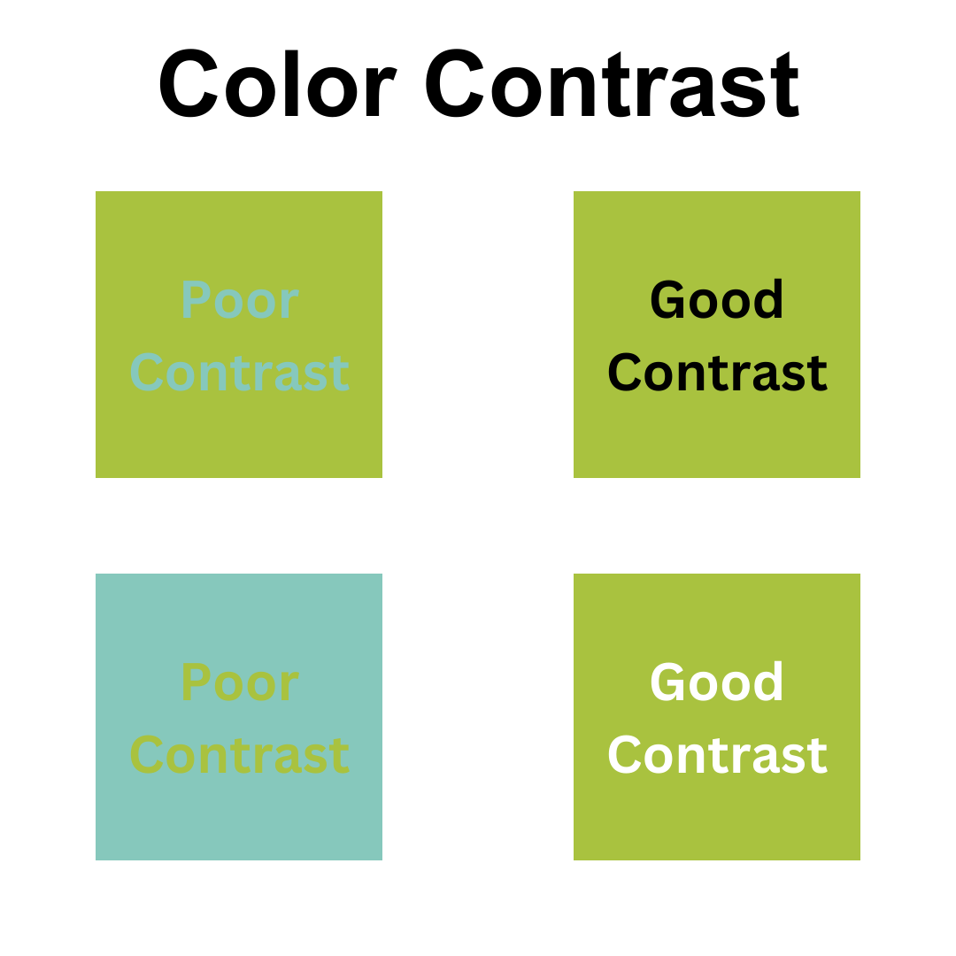
Have you ever squinted at a slide deck with color combos that make your eyes water? Yeah, I’ve been there! Certain hues don’t jive well together, which is visually taxing for anyone. But let’s not stop at aesthetics; think about your audience. Consider those with dyslexia, color blindness, or other visual challenges. Try sans-serif fonts like Arial, Calibri, or Verdana—they’re easier on the eyes. And remember to play with contrast; it can be a game-changer for readability. Tools like the Coolors- Color Contrast Checker can be lifesavers, ensuring your colors meet accessibility standards. Oh, and don’t rely solely on color to convey your message; toss in some text or symbols to cater to everyone, including those with color blindness.
Tip #2: Keep It Simple Silly
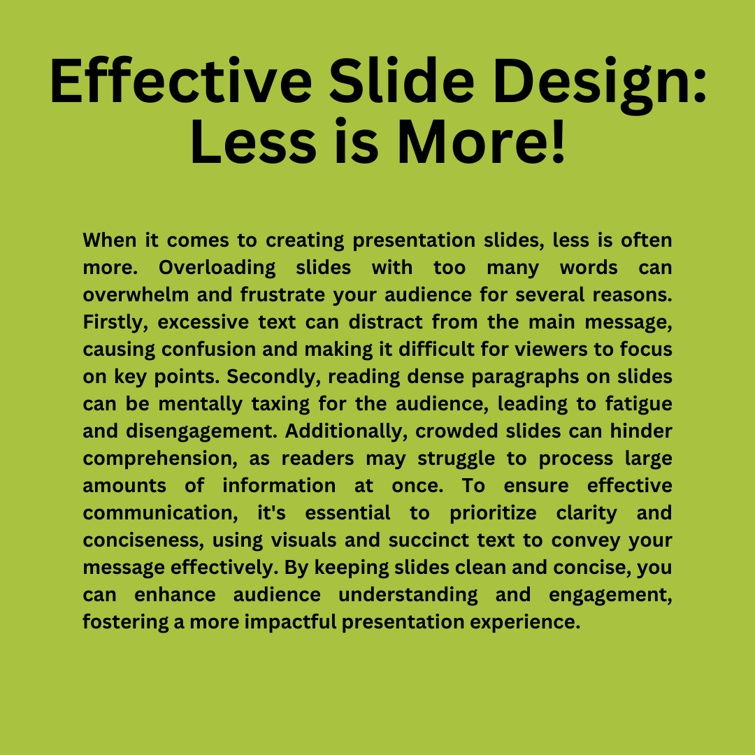
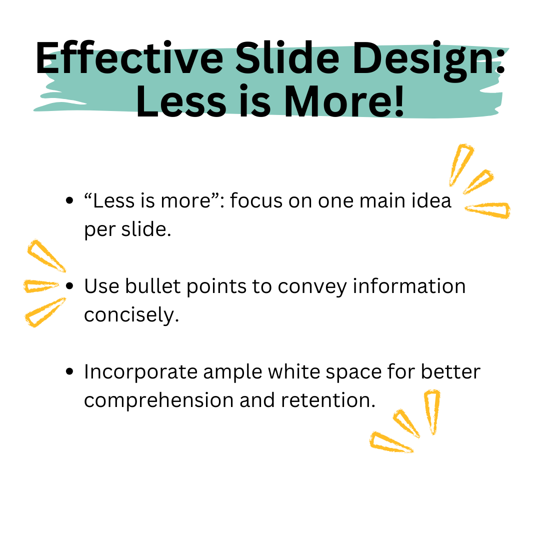
Ever heard the phrase “Less is more”? Well, when it comes to slides, simplicity reigns supreme. I mean, have you ever tried deciphering a slide crammed with text and images? Talk about a headache! Let’s take a page from Keith Tramper’s playbook: “Aggressively Delete Non-Essential Content.” (Training Industry. n.d.) Each slide should sing a solo, focusing on one main idea or concept. Keep it short and sweet with bullet points, and don’t forget to give your slides some breathing room with ample white space. Less clutter means easier comprehension and better retention for your audience.
Tip #3: Use Visual Aids for Clarity
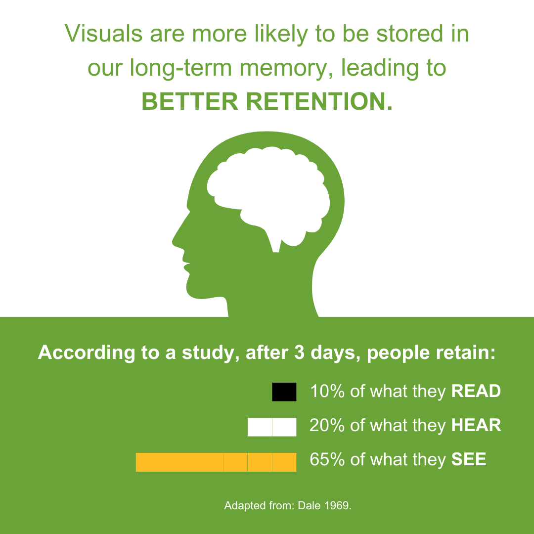
They say a picture is worth a thousand words, right? Well, let’s milk that for all it’s worth! Visual aids can be your secret weapon, clarifying complex concepts and jazzing up your presentation. Think diagrams, charts, or graphs—anything to add a visual pop and complement your spoken word. But remember, ensure your visuals are large and clear enough for everyone in the room to see without straining their eyes.
Tip #4: Utilize Multimedia for Multiple Modalities
We’re all wired differently, aren’t we? Some folks thrive on visuals, while others are all ears. And then some learn best by doing. That’s where multimedia comes in handy! Sprinkle in some videos, audio clips, or interactive features to cater to everyone’s learning style. And hey, don’t leave anyone out—offer transcripts or captions for those who prefer reading over watching. Get your audience involved with interactive elements like polls or group discussions; it’s a surefire way to keep them engaged and on their toes!
Tip #5: Include Inclusive Images
Picture this: you’re sitting in a presentation, and all the images on the slides look nothing like you or the folks around you. It’s a bummer, right? Let’s change that! Include images that reflect the diversity of your audience—different races, ethnicities, ages, abilities—you name it. It’s all about making everyone feel seen and valued. So, celebrate the unique perspectives and contributions of every individual in the room.

By weaving these five simple tricks into your presentations, you’ll be able to elevate the accessibility, inclusivity, and overall effectiveness of your slide decks. Let’s create presentations that resonate with and empower every member of the audience. After all, inclusivity is the name of the game!
Resources for Accessibility
If you’re eager to learn more about accessibility, I highly recommend checking out the For the Purpose of… podcast. You can listen to the episode on Accessible Design. If you’d like to earn credit, you can sign up for For the Purpose of… podcast PDx and earn SCECH credits for listening to the podcast. It’s an excellent opportunity to deepen your understanding of accessibility and inclusive design while earning professional development credits.
Additionally, for a handy reference on accessible design practices, be sure to check out the “Accessible Design Quick Sheet” created by the Kent ISD EdTech team. This resource provides practical tips and guidelines for creating accessible materials, complementing the strategies discussed in this blog post.
#InclusivePresentations #AccessibilityTips #EngageEveryLearner #UniversalDesign #WeLeadLearning #KentISDpd #FTPOpodcast
Citations
Dale E. 1969. Cone of experience, in Educational Media: Theory into Practice. Wiman RV (ed). Charles Merrill: Columbus, Ohio
Training Industry. (n.d.). TMI: Cognitive Overload and Learning. Retrieved from https://www.td.org/insights/tmi-cognitive-overload-and-learning
This blog post was written by Amanda Walma, T/L Marketing and Communications Specialist for Kent ISD and edited by Keith Tramper, Education Technology Consultant for Kent ISD.
